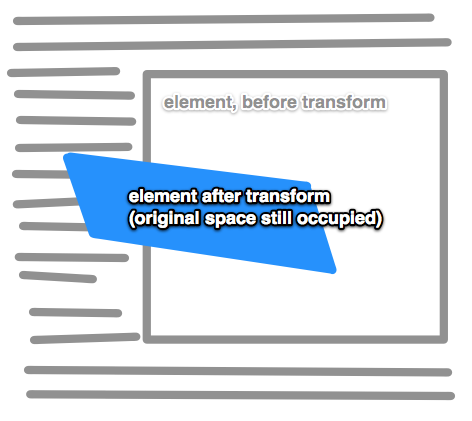
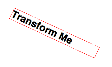
The CSS transform property allows you to visually manipulate element, literally transforming their appearance.
div {
  transform: transform-function || none; /* can list multiple, space-separated */
}
or with proper prefixes:
div {
  -webkit-transform: value;
  -moz-transform:    value;
  -ms-transform:     value;
  -o-transform:      value;
  transform:         value;
}

Rotate
transform: rotate(angle);
Rotates clockwise from current position.

Scale
transform: scale(value, [value]);
Affects the size of the element. Those scale values are “unitless” meaning it’s essentially a multiplier. In the above syntax, if you apply one value it will stretch the element in both directions. So, scale(2) means “make it twice as big as it just was.” Giving it two values means to stretch it horizontally by the first value and vertically by the second. Or you can be more specific by:
transform: scaleX(value);
transform: scaleY(value);
Skew
transform: skewX(value);  /* e.g. skewX(25deg) */
transform: skewY(value);
Tilts an element one way or another. Like turning a rectangle into a parallelogram.

There is no shorthand for skew, use the specific two functions above.
Translate
transform: translate(value [, value]);
Moves an element sideways or up and down. Why not just use top/left/bottom/right? Well it’s a bit confusing at times. I would think of those as layout/positioning (they have better browser support anyway) and this as a way to move those things around as part of a transition or animation. Using translate will be hardware accelerated while those positioning values wouldn’t be, which is a bonus.
transform: translate(value [, value]);
These values would be any length value, like 10px or 2.4em. One value will move the element to the right (negative values to the left). If a second value is provided, that second value will move it down (negative values up). Or you can get specific:
transform: translateX(value);
transform: translateY(value);
Matrix
The matrix transform function can be used to combine all transforms into one. It’s a bit like transform shorthand, only I don’t believe it’s really intended to be written by hand. There are tools out there like The Matrix Resolutions which can convert a group of transforms into a single matrix declaration. Perhaps in some situations this can reduce file size, although author-unfriendly micro optimizations like that are likley not worth your time.
For the curious, this:
rotate(45deg) translate(24px, 25px)
can also be represented as:
matrix(0.7071067811865475, 0.7071067811865476, -0.7071067811865476, 0.7071067811865475, -0.7071067811865497, 34.648232278140824)
3D Transforms
Most of the above properties have 3D versions of them.
translate3d(x, y, z)
translateZ(z)
The third value in translate3d or the value in translateZ moves the element toward the viewer, negative values away.
scale3d(sx, sy, sz)
scaleZ(sz)
The third value in scale3d or the value in scaleZ affects the scaling along the z-axis (e.g. the imaginary line coming straight out of the screen).
rotateX(value)
rotateY(value)
rotate3d(x, y, z)
rotateX and rotateY will rotate an element in 3D space around those axises. rotate3d allows you to specify a point in 3D space in which to rotate the element around.
matrix3d(…)
A way to programmatically describe a 3D transform in a 4×4 grid. Nobody will ever hand write one of these ever.
perspective(value)
This value doesn’t affect the element itself, but it affects the transforms of descendent elements 3D transforms, allowing them to all have a consistent depth perspective.
Related Properties
Browser Support
2D Transforms
| Chrome | Safari | Firefox | Opera | IE | Android | iOS |
|---|---|---|---|---|---|---|
| Any | 3.1+ | 3.5+ | 10.5+ | 10+ | ? | At least 4 |
3D Transforms
| Chrome | Safari | Firefox | Opera | IE | Android | iOS |
|---|---|---|---|---|---|---|
| 10+ | 4+ | 12+ | none | 10+ | ? | 5? |

 Share
Share Tweet
Tweet Email
Email
Leave a Reply