The align-items property is a sub-property of the Flexible Box Layout module.
It defines the default behaviour for how flex items are laid out along the cross axis on the current line. You can think of it as the justify-content version for the cross-axis (perpendicular to the main-axis).
The align-items property accepts 5 different values:
flex-start: cross-start margin edge of the items is placed on the cross-start lineflex-end: cross-end margin edge of the items is placed on the cross-end linecenter: items are centered in the cross-axisbaseline: items are aligned such as their baselines alignstretch(default): stretch to fill the container (still respect min-width/max-width)
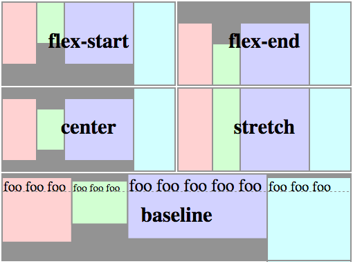
The following figure helps understand how flex items are layed out depending on the align-items value.
Syntax
align-items: flex-start | flex-end | center | baseline | stretch

.flex-container {
  align-items: flex-start;
}
Demo
The following demo shows how flex items are layed out depending on the align-itemsvalue:
- The red list is set to
flex-start - The yellow list is set to
flex-end - The blue list is set to
center - The green list is set to
baseline - The pink list is set to
stretch
<ul class="flex-container flex-start">
  <li class="flex-item">1<br>2</li>
  <li class="flex-item">3</li>
  <li class="flex-item">4<br>5</li>
  <li class="flex-item">6</li>
</ul>

<ul class="flex-container flex-end">
  <li class="flex-item">1<br>2</li>
  <li class="flex-item">3</li>
  <li class="flex-item">4<br>5</li>
  <li class="flex-item">6</li>
</ul>

<ul class="flex-container center">
  <li class="flex-item">1<br>2</li>
  <li class="flex-item">3</li>
  <li class="flex-item">4<br>5</li>
  <li class="flex-item">6</li>
</ul>

<ul class="flex-container baseline">
  <li class="flex-item">1<br>2</li>
  <li class="flex-item">3</li>
  <li class="flex-item">4<br>5</li>
  <li class="flex-item">6</li>
</ul>

<ul class="flex-container stretch">
  <li class="flex-item">1<br>2</li>
  <li class="flex-item">3</li>
  <li class="flex-item">4<br>5</li>
  <li class="flex-item">6</li>
</ul>
.flex-container {
  padding: 0;
  margin: 0;
  list-style: none;

  -ms-box-orient: horizontal;
  display: -webkit-box;
  display: -moz-box;
  display: -ms-flexbox;
  display: -moz-flex;
  display: -webkit-flex;
  display: flex;
  float: left;
}

.flex-start {
  -webkit-align-items: flex-start;
  align-items: flex-start;
}

.flex-end {
  -webkit-align-items: flex-end;
  align-items: flex-end;
}
.flex-end li {
  background: gold;
}

.center {
  -webkit-align-items: center;
  align-items: center;
}
.center li {
  background: deepskyblue;
}

.baseline {
  -webkit-align-items: baseline;
  align-items: baseline;
}
.baseline li {
  background: lightgreen;
}

.stretch {
  -webkit-align-items: stretch;
  align-items: stretch;
}
.stretch li {
  background: hotpink;
}

.flex-item {
  background: tomato;
  padding: 5px;
  width: 50px;
  margin: 5px;

  line-height: 50px;
  color: white;
  font-weight: bold;
  font-size: 2em;
  text-align: center;
}
Related Properties
Browser Support
- (modern) means the recent syntax from the specification (e.g.
display: flex;) - (hybrid) means an odd unofficial syntax from 2011 (e.g.
display: flexbox;) - (old) means the old syntax from 2009 (e.g.
display: box;)
| Chrome | Safari | Firefox | Opera | IE | Android | iOS |
|---|---|---|---|---|---|---|
| 21+ (modern) 20- (old) |
3.1+ (old) | 2-21 (old) 22+ (new) |
12.1+ (modern) | 10+ (hybrid) | 2.1+ (old) | 3.2+ (old) |
Blackberry browser 10+ supports the new syntax.
 Share
Share Tweet
Tweet Email
Email
Leave a Reply