The align-content property is a sub-property of the Flexible Box Layout module.
It helps aligning a flex container’s lines within it when there is extra space in the cross-axis, similar to how justify-content aligns individual items within the main-axis.
Note, this property has no effect when the flexbox has only a single line.
The align-content property accepts 6 different values:
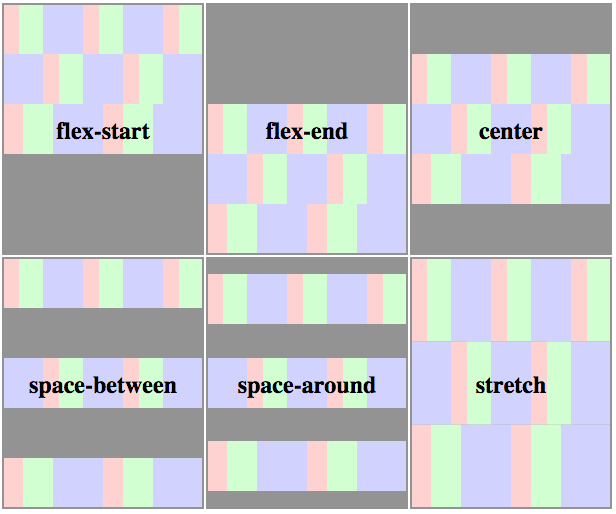
flex-start: lines packed to the start of the containerflex-end: lines packed to the end of the containercenter: lines packed to the center of the containerspace-between: lines evenly distributed; the first line is at the start of the container while the last one is at the endspace-around: lines evenly distributed with equal space between themstretch(default): lines stretch to take up the remaining space
The following figure helps understand how the lines are stacked up in a flex container depending on the align-content value:
Syntax
align-content: flex-start | flex-end | center | space-between | space-around | stretch

.flex-container {
  align-content: space-around;
}
Demo
The following demo shows how lines are stacked out depending on the `align-content` value:
- The red list is set to
flex-start - The yellow list is set to
flex-end - The blue list is set to
center - The green list is set to
space-between - The pink list is set to
space-around - The brown list is set to
stretch
<ul class="flex-container flex-start">
  <li class="flex-item">1</li>
  <li class="flex-item">2</li>
  <li class="flex-item">3</li>
  <li class="flex-item">4</li>
  <li class="flex-item">5</li>
  <li class="flex-item">6</li>
</ul>

<ul class="flex-container flex-end">
  <li class="flex-item">1</li>
  <li class="flex-item">2</li>
  <li class="flex-item">3</li>
  <li class="flex-item">4</li>
  <li class="flex-item">5</li>
  <li class="flex-item">6</li>
</ul>

<ul class="flex-container center">
  <li class="flex-item">1</li>
  <li class="flex-item">2</li>
  <li class="flex-item">3</li>
  <li class="flex-item">4</li>
  <li class="flex-item">5</li>
  <li class="flex-item">6</li>
</ul>

<ul class="flex-container space-between">
  <li class="flex-item">1</li>
  <li class="flex-item">2</li>
  <li class="flex-item">3</li>
  <li class="flex-item">4</li>
  <li class="flex-item">5</li>
  <li class="flex-item">6</li>
</ul>

<ul class="flex-container space-around">
  <li class="flex-item">1</li>
  <li class="flex-item">2</li>
  <li class="flex-item">3</li>
  <li class="flex-item">4</li>
  <li class="flex-item">5</li>
  <li class="flex-item">6</li>
</ul>

<ul class="flex-container stretch">
  <li class="flex-item">1</li>
  <li class="flex-item">2</li>
  <li class="flex-item">3</li>
  <li class="flex-item">4</li>
  <li class="flex-item">5</li>
  <li class="flex-item">6</li>
</ul>
.flex-container {
  padding: 0;
  margin: 0;
  list-style: none;
  float: left;
  width: 120px;
  height: 300px;
  padding: 10px;
  border: 1px solid silver;
  margin-top: 10px;

  -ms-box-orient: horizontal;
  display: -webkit-box;
  display: -moz-box;
  display: -ms-flexbox;
  display: -moz-flex;
  display: -webkit-flex;
  display: flex;

  -webkit-flex-flow: row wrap;
  flex-flow: row wrap;
}

.flex-start {
  -webkit-align-content: flex-start;
  align-content: flex-start;
}

.flex-end {
  -webkit-align-content: flex-end;
  align-content: flex-end;
}
.flex-end li {
  background: gold;
}

.center {
  -webkit-align-content: center;
  align-content: center;
}
.center li {
  background: deepskyblue;
}

.space-between {
  -webkit-align-content: space-between;
  align-content: space-between;
}
.space-between li {
  background: lightgreen;
}

.space-around {
  -webkit-align-content: space-around;
  align-content: space-around;
}
.space-around li {
  background: hotpink;
}

.stretch {
  -webkit-align-content: stretch;
  align-content: stretch;
}
.stretch li {
  background: chocolate;
}

.flex-item {
  background: tomato;
  padding: 5px;
  width: 50px;
  height: 50px;

  line-height: 50px;
  color: white;
  font-weight: bold;
  font-size: 2em;
  text-align: center;
}
Related Properties
Browser Support
- (modern) means the recent syntax from the specification (e.g. display: flex;)
- (hybrid) means an odd unofficial syntax from 2011 (e.g. display: flexbox;)
- (old) means the old syntax from 2009 (e.g. display: box;)
| Chrome | Safari | Firefox | Opera | IE | Android | iOS |
|---|---|---|---|---|---|---|
| 21+ (modern) 20- (old) |
3.1+ (old) | 2-21 (old) 22+ (new) |
12.1+ (modern) | 10+ (hybrid) | 2.1+ (old) | 3.2+ (old) |
Blackberry browser 10+ supports the new syntax.
 Share
Share Tweet
Tweet Email
Email
Leave a Reply