Every element on a web page is a rectangular box. The display property in CSS determines just how that rectangular box behaves. There are only a handful of values that are commonly used:
div {
  display: inline;        /* Default of all elements, unless UA stylesheet overrides */
  display: inline-block;  /* Characteristics of block, but sits on a line */
  display: block;         /* UA stylesheet makes things like <div> and <section> block */
  display: run-in;        /* Not particularly well supported or common */
  display: none;          /* Hide */
}
The default value for all elements is inline. Most “User Agent stylesheets” (the default styles the browser applies to all sites) reset many elements to “block”. Let’s go through each of these, and then cover some of the other less common values.
Inline
The default value for elements. Think of elements like <span>, <em>, or <b> and how wrapping text in those elements within a string of text doesn’t break the flow of the text.
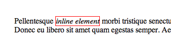
An inline element will accept margin and padding, but the element still sits inline as you might expect. Margin and padding will only push other elements horizontally away, not vertically.
An inline element will not accept height and width. It will just ignore it.
Inline Block
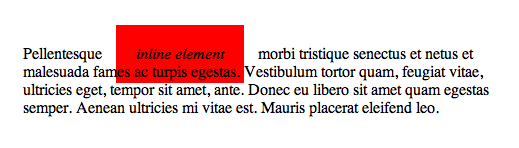
An element set to inline-block is very similar to inline in that it will set inline with the natural flow of text (on the “baseline”). The difference is that you are able to set a width and height which will be respected.
Block
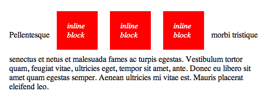
A number of elements are set to block by the browser UA stylesheet. They are usually container elements, like <div>, <section>, and <ul>. Also text “blocks” like <p> and <h1>. Block level elements do not sit inline but break past them. By default (without setting a width) they take up as much horizontal space as they can.
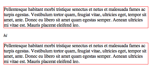
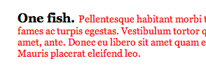
The two elements with the red borders are <p>s which are block level elements. The <em> element in between them doesn’t sit inline because the blocks break down below inline elements.
Run-in
First, this property doesn’t work in Firefox. Word is that the spec for it isn’t well defined enough. To begin to understand it though, it’s like if you want a header element to sit inline with the text below it. Floating it won’t work and neither will anything else, as you don’t want the header to be a child of the text element below it, you want it to be its own independent element. In “supporting” browsers, it’s like this:
None
Totally removes the element from the page. Note that while the element is still in the DOM, it is removed visually and any other conceivable way (you can’t tab to it or its children, it is ignored by screen readers, etc).
Table Values
There is a whole set of display values the force non-table elements to behave like table-elements, if you need that to happen. It’s rare-ish, but it sometimes allows you to be “more semantic” with your code while utilizing the unique positioning powers of tables.
div {
  display: table;
  display: table-cell;
  display: table-column;
  display: table-colgroup;
  display: table-header-group;
  display: table-row-group;
  display: table-footer-group;
  display: table-row;
  display: table-caption;
}
To use, just mimic normal table structure. Simple example:
<div style="display: table;">
  <div style="display: table-row;">
    <div style="display: table-cell;">
      Gross but sometimes useful.
    </div>
  </div>
</div>
Flexbox
The display property is also used for new fangled layout methods like Flexbox.
.header {
  display: flex;
}
There are some older versions of flexbox syntax, so please consult this article for the syntax in using flexbox with the best browser support. Be sure to see this complete guide to Flexbox.
Grid
Grid layout will also be initially set by the display property.
body {
  display: grid;
}
Although at the time of this update, only IE 10 is supporting it.
 Share
Share Tweet
Tweet Email
Email
Leave a Reply