The justify-content property is a sub-property of the Flexible Box Layout module.
It defines the alignment along the main axis. It helps distribute extra free space leftover when either all the flex items on a line are inflexible, or are flexible but have reached their maximum size. It also exerts some control over the alignment of items when they overflow the line.
The justify-content property accepts 5 different values:
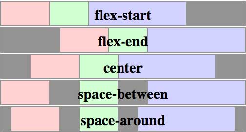
flex-start(default): items are packed toward the start lineflex-end: items are packed toward to end linecenter: items are centered along the linespace-between: items are evenly distributed in the line; first item is on the start line, last item on the end linespace-around: items are evenly distributed in the line with equal space around them
The following figure helps understand what the justify-content property actually does:
Syntax
justify-content: flex-start | flex-end | center | space-between | space-around;

.flex-item {
  justify-content: center;
}
Demo
The following demo shows how flex items behave depending on `justify-content` value:
- The red list is set to
flex-start - The yellow is set to
flex-end - The blue is set to
center - The green is set to
space-between - The pink is set to
space-around
<ul class="flex-container flex-start">
  <li class="flex-item">1</li>
  <li class="flex-item">2</li>
  <li class="flex-item">3</li>
  <li class="flex-item">4</li>
  <li class="flex-item">5</li>
</ul>

<ul class="flex-container flex-end">
  <li class="flex-item">1</li>
  <li class="flex-item">2</li>
  <li class="flex-item">3</li>
  <li class="flex-item">4</li>
  <li class="flex-item">5</li>
</ul>

<ul class="flex-container center">
  <li class="flex-item">1</li>
  <li class="flex-item">2</li>
  <li class="flex-item">3</li>
  <li class="flex-item">4</li>
  <li class="flex-item">5</li>
</ul>

<ul class="flex-container space-between">
  <li class="flex-item">1</li>
  <li class="flex-item">2</li>
  <li class="flex-item">3</li>
  <li class="flex-item">4</li>
  <li class="flex-item">5</li>
</ul>

<ul class="flex-container space-around">
  <li class="flex-item">1</li>
  <li class="flex-item">2</li>
  <li class="flex-item">3</li>
  <li class="flex-item">4</li>
  <li class="flex-item">5</li>
</ul>
.flex-container {
  padding: 0;
  margin: 0;
  list-style: none;

  -ms-box-orient: horizontal;
  display: -webkit-box;
  display: -moz-box;
  display: -ms-flexbox;
  display: -moz-flex;
  display: -webkit-flex;
  display: flex;
}

.flex-start {
  -webkit-justify-content: flex-start;
  justify-content: flex-start;
}

.flex-end {
  -webkit-justify-content: flex-end;
  justify-content: flex-end;
}
.flex-end li {
  background: gold;
}

.center {
  -webkit-justify-content: center;
  justify-content: center;
}
.center li {
  background: deepskyblue;
}

.space-between {
  -webkit-justify-content: space-between;
  justify-content: space-between;
}
.space-between li {
  background: lightgreen;
}

.space-around {
  -webkit-justify-content: space-around;
  justify-content: space-around;
}
.space-around li {
  background: hotpink;
}

.flex-item {
  background: tomato;
  padding: 5px;
  width: 60px;
  height: 50px;
  margin: 5px;

  line-height: 50px;
  color: white;
  font-weight: bold;
  font-size: 2em;
  text-align: center;
}
Related Properties
Browser Support
- (modern) means the recent syntax from the specification (e.g.
display: flex;) - (hybrid) means an odd unofficial syntax from 2011 (e.g.
display: flexbox;) - (old) means the old syntax from 2009 (e.g. display: box;)
| Chrome | Safari | Firefox | Opera | IE | Android | iOS |
|---|---|---|---|---|---|---|
| 21+ (modern) 20- (old) |
3.1+ (old) | 2-21 (old) 22+ (new) |
12.1+ (modern) | 10+ (hybrid) | 2.1+ (old) | 3.2+ (old) |
Blackberry browser 10+ supports the new syntax.
 Share
Share Tweet
Tweet Email
Email
Leave a Reply