* {
   -moz-box-sizing:    border-box;   /* Firefox 1, probably can drop this */
   -webkit-box-sizing: border-box;   /* Safari 3-4, also probably droppable */
    box-sizing:        border-box;   /* Everything else */
}
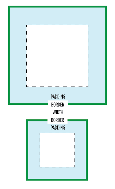
The box-sizing property in CSS controls how the “box model” is handled in regards to page layout. For instance, if you set an element to width: 100px; padding: 20px; border: 5px solid black; the resulting box is 150px wide. That is because the default box-sizing model is content-box, which behaves that way. Through the box-sizing property we can change that to padding-box (in which case the box would be 110px wide with 20px of padding on the inside), or border-box (in which case the box would be 100px wide with 10px of border and 20px of padding on the inside).
See this example comparing default content-box to border-box:

This is particularly useful on things like <textarea> which you need to explicitly set to 100% width if you want it to fill a parent container, but is also likely you want padding on. Without box-sizing, you would an elaborate faking strategy involving extra wrapper elements.
This also makes fluid/float/grid layouts a lot easier where you want to use percentages for the grids but with fixed pixel padding.
Browser Support
| Chrome | Safari | Firefox | Opera | IE | Android | iOS |
|---|---|---|---|---|---|---|
| any | 3+ | 1+ | 7+ | 8+ | ? | any |

 Share
Share Tweet
Tweet Email
Email
Leave a Reply